Instagram Print
Mobile App Prototype @ General Assembly
Instagram Print was a project for General Assembly’s UXDI class in partnership with Paz Perez and Christina Vu. In the (fictional) brief, Instagram needed a way to diversify their revenue stream and needed a new printing feature to be developed.
The team for this project was really tight-knit, and the process was a big exercise in participatory design, from user research to prototyping.
Towards the end of the project, my role shifted to assembling the app prototype using Axure, which you can play around with here.
Competitive analysis, User Research and Affinity Mapping
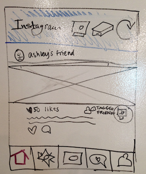
We set our core concept as an expansion of Instagram’s brand into the real world by connecting Instagram into the old way of sharing — through printing and gifting pictures.
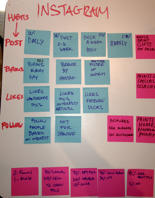
A survey, combined with several rounds of user interviews, allowed us to understand the users’ photo printing needs and Instagram usage habits.
Competitive research showed pain-points of competitors and highlighted one of our main value propositions: being able to print your friends’ pictures.
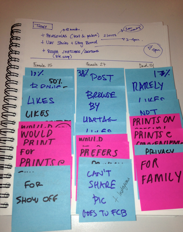
Research results were aggregated in an affinity map, to prioritize user needs and features, which was then used to build three personas for the project.

"Love my new apartment and my roommate, can’t wait to decorate the empty walls."

"I Instagram from the moment I wake up to the moment I go to sleep."

"I love taking pictures, but I love not wasting my time even more."
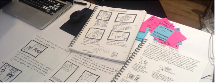
Storyboarding and User Flows
A quick storyboarding session helped to shape the first user flows and made clear how the user would move through the new feature in order to print their pictures.
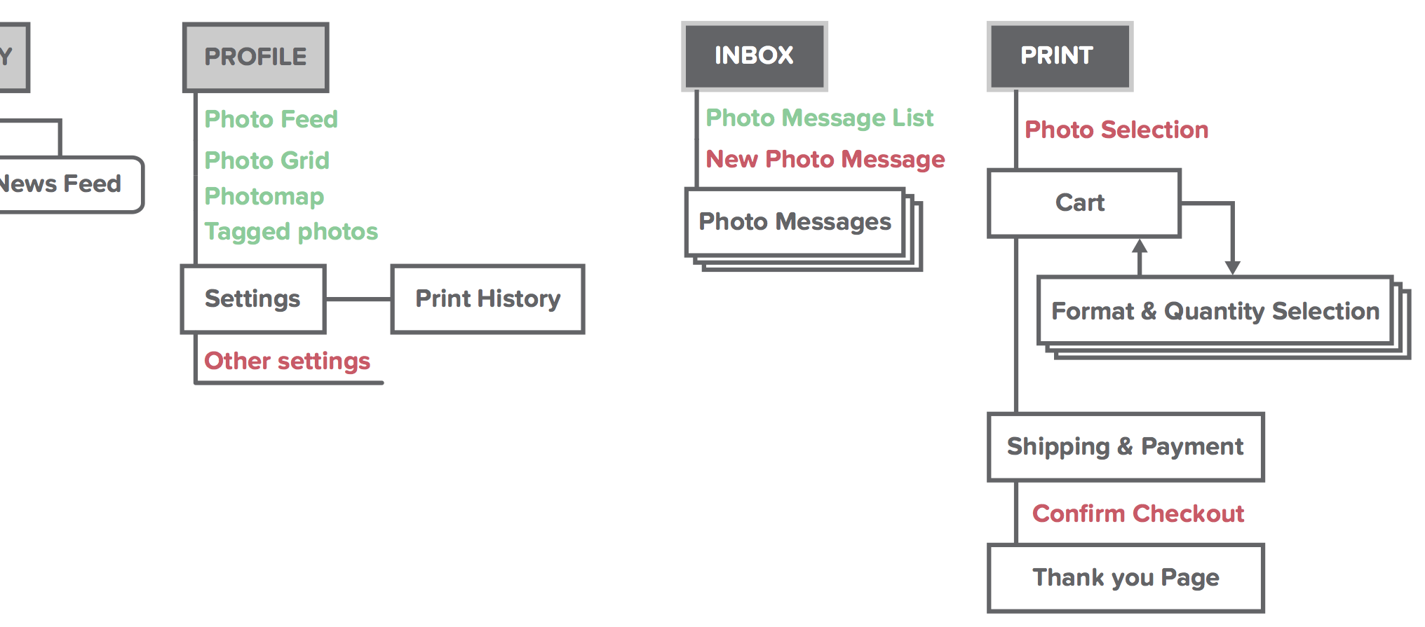
The flows were complemented by an overview of the new feature in comparison to the rest of app’s architecture.
Sketching, Testing, Prototyping, Testing, Testing
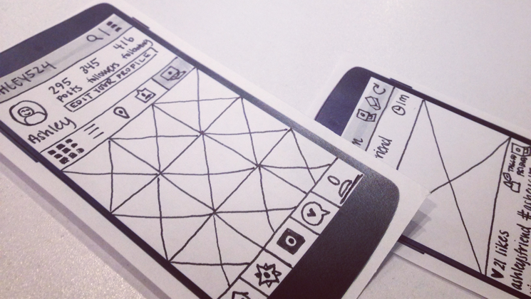
Early sketches were done in group on the whiteboard, as a way to get the team on the same page and define initial expectations for the interface.
These were followed by several batches of rough wireframes that solidified the idea we had for the interface and allowed us to move forward to user testing.
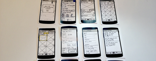
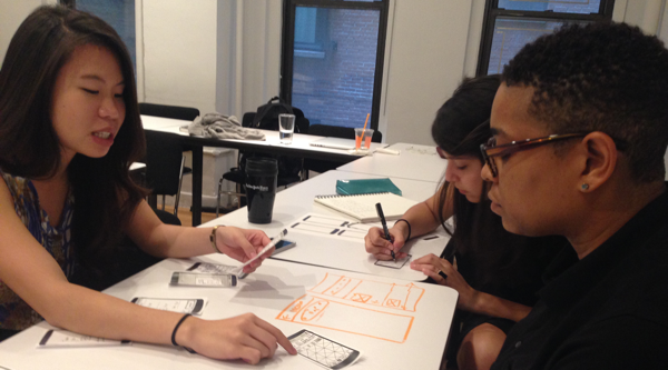
Doing tests with paper prototypes allowed us to sketch, test and incorporate feedback much faster than going straight to digital.
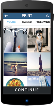
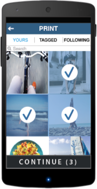
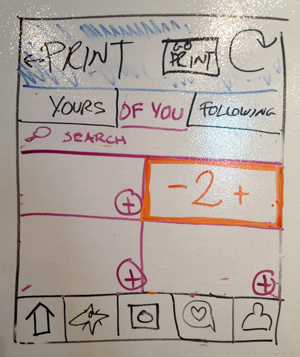
Product selection and checkout screens were specially challenging, interface-wise: our first version had too much information density, while further down the road we over-simplified. Only through several iterations and a lot of testing we found the right balance.
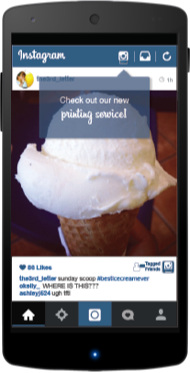
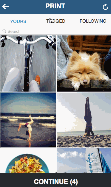
When we were ready to move forward, the team finished the final mockups, while I prepared the interactive prototype using Axure – which included mimicking some of Instagram’s native interactions, as pictured below.
Check out the fully interactive prototype here.
Design at close quarters
The deadline was tough, but the close-knit teamwork and the test-driven approach enabled us to achieve great results in a short amount of time.
Loads of testing allowed us to constantly fix our assumptions, while having the team in sync meant better feedback — and thus, a better design output.