Writing about your own work can be hard. Writing about a past project is even harder — information is not so fresh and documentation might be lost. Teaming up with somebody else to write about a 3 year-old team project… well, that’s almost archeology, considering I joined the team at VTEX only a year ago.

I teamed up with Augusto, our most senior designer, to write the case study on Smart Checkout, a project that took place between 2010 and 2013 and helped take the whole platform to a new level.

Continue reading

Also avaliable on Medium

VTEX is an online commerce platform with headquarters in Rio de Janeiro, almost 200 employees and 60+ software developers. Our clients range from big enterprise operations to small shops in over 11 countries around the world.

When I joined the team a year ago, I didn’t really have a lot of experience designing products for the web. Sure, I had enough education and knew how to do design stuff, but no matter how much you train yourself to design things, you will never be prepared to the harsh reality of not being capable to deliver the products you want to.

Continue reading

Also avaliable on Medium

Writing code is hard. For every 1 minute of bliss typing characters in the computer and seeing it render things that didn’t exist before, there are 10 minutes of frustration with unreadable code and bugs that didn’t exist the night before.

Writing code with Git is hard. Writing code without it is unthinkable. Whether you’re senior developer on a huge team or a designer who just started dabbling with front-end for personal projects, using Git will change the way you code for the best and make group collaboration enjoyable.

This guide will walk you through basic concepts in Git with some hands-on action at the end. It won’t make you a Git master, but you will be able to use Git by yourself with Github and it’s desktop app.

Continue reading

Also avaliable on Medium

We think in flows, and we’re used to the physical world. When a door opens, it swings on an arc. When something travels, you can see it move. When something falls, you can see it bounce.

Awkward UI is when a product designer doesn’t take these things into account. That means that somewhere along the line, some rules have been broken.

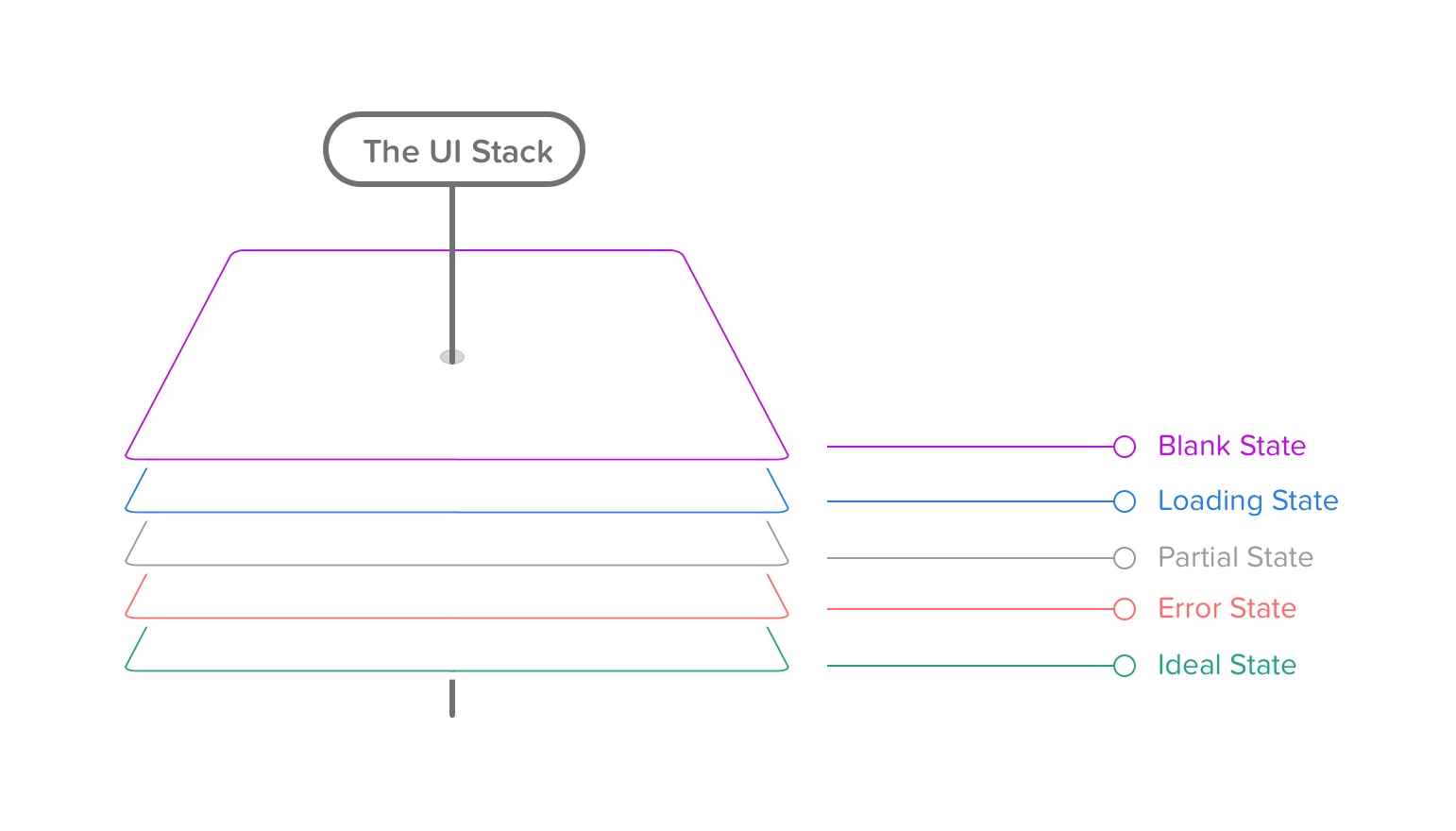
The rules of the UI Stack.

This fantastic article is really helpful to navigate the dizziness of the design process for large multi-state applications. It has some parallels with Everett McKay’s approach in UI is Communication.

If we’re able to identify why we trust Baskerville so much—the form, the weight, the context in which it’s presented—is it possible to design a font to achieve certain emotional effects?

Bierut likens the reaction to typefaces to the way a voice can impact the way we perceive what’s been spoken. “In a way, typefaces are the graphic equivalent of the human voice, and each voice has a specific timbre and accent,” he says. “In my mind, Baskerville speaks with a calm, confidence-inspiring English accent, sort of like Colin Firth. No wonder it’s so trustworthy.”

So many good points on mission, values and building a company. Don’t let the title fool you, there’s no “management” advice in this list.

Some highlights:

It’s terribly difficult to manage unmotivated people. Make your job easier and don’t.

Fire quickly. If you don’t fire bad performers fast, you’re at risk of losing your good performers. Don’t underestimate the effect bad performers have on good performers. Your team will likely move faster even with fewer bodies. Finally, firing for bad performance is easier than having to fire good people because you’ve run out of money, so fire the bad people before you have to fire the good people too.

How you spend money is one of the biggest cultural signals you can send and is very hard to change. Where you spend money (and where you don’t) communicates what you think is important.

Each of us has a tiny designer somewhere inside

We can all contribute to a design. You probably think that’s ridiculous, but that’s also the reason design projects can devolve so quickly: respect is lacking.

A dual email course for designers and non-designers to improve understanding between both parts and make the design process less stressful and more productive.

I first found out about this project through their Facebook page and was glad when they started doing more in-depth interviews on Medium. The first is with Sophie Xie, product designer formely working on Facebook.

The interview says a lot about being a woman in tech, including things that sometimes go unnoticed for me as a man. If men want to change the subtle sexist behavior in their workspace, paying actual attention to what we’re doing is the first step (I guess).

By the way, as far as advice goes, you can’t really get more badass than this:

What advice do you have for any girls pursuing a future in tech?
tldr; I was successful in moments I quit being a nice girl and started becoming a monster.

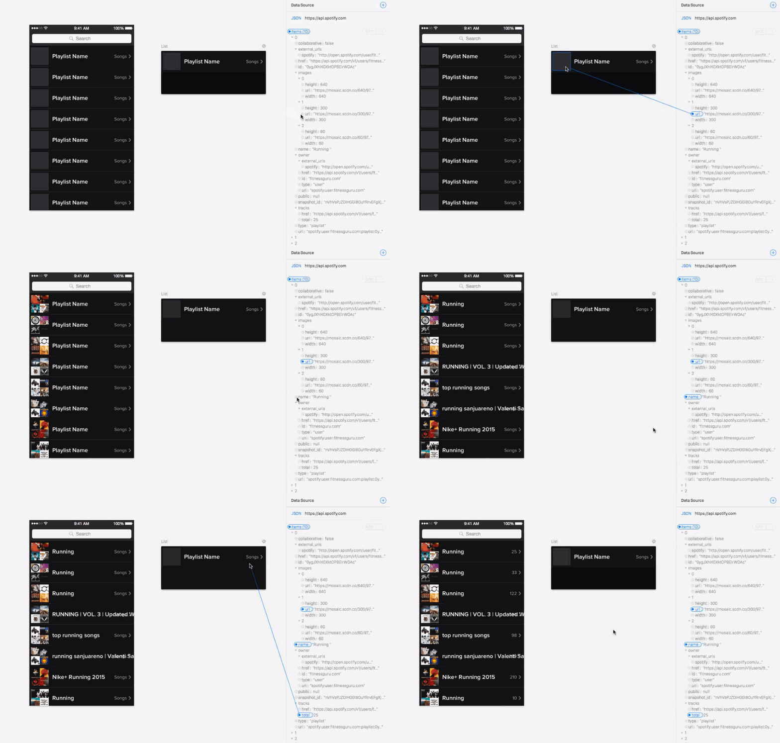
Another entry in Josh Puckett’s exploration on future design tools for the workflow we need today.

I believe one of the biggest flaws of today’s tools is their failure to allow designers to easily work with real data. (…)
We spend an inordinate amount of time making our pixel-perfect fabrications. We then make sub-optimal decisions based on this, considering only our single, perfect state. We are surprised when our designs are implemented because we forgot to solve a variety of edge cases and problems. When we don’t work with real data, we deceive ourselves.

I recently came across this past issue from the Mailchimp UX Newsletter and remembered how outstanding is their writing. If you haven’t subscribed yet, do it now.

Here are some highlights from the issue:

Hiring

It’s easy to hire someone who’s mediocre, but it’s really hard to fire them. Mediocre people are a drag on quality and moral, but they tend to do just enough good work to stick around. Managers have a tough time justifying letting them go because there’s no actionable offense. The scent of mediocrity on your team will also scare off talented candidates.

Respect

Respect between design and development is the most critical ingredient when making great products. It’s rare that respect between design and development happens organically. It has to be a core value of a company, demonstrated by leadership daily.

Respect fosters a can-do attitude. Ideas are freely shared when they’re valued by colleagues, even when they’re not necessarily a winner. We could do a lot better if we started with “Yes, and..” instead of “No.”

Team Size

Our UX team is tiny. Twelve of us do the research, design the UI, and build the front-end of the app. The engineering team we work with is equally small. But our size is not a shortcoming; it’s an advantage. Communication is easy when teams are small. Planning happens quickly so we can get back to making.

Each little team has the autonomy to make decisions about their work, and when there’s uncertainty, they can go discuss with another autonomous team that can provide more definitive direction.

These are traits I hope to find and foster at VTEX, with whom I just started working as a product designer. The fact that this article about UX was shared by a developer from our team tells me these methods are already under way for the most part

I had heard before how far you can go with animations on Keynote, but this article just smashes the point through your skull — the two videos are super handy for that.

There’s no way I’m not trying this for prototyping really soon.

Web Developer Ray Bango talks about impostor syndrome and how the ever-increasing pace of web technologies makes us all feel like we’re in a hamster wheel. Make sure to watch the short video embeded in the article, really drives the point home!

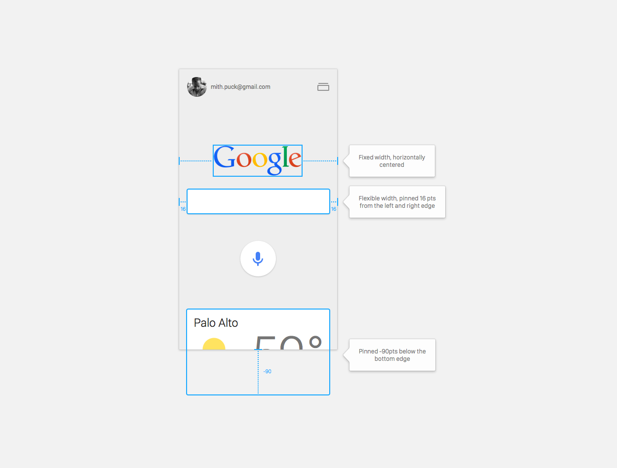
We live in a world that is dynamic, designing and building software that lives on devices that are always changing and evolving. These devices have multiple screen sizes, densities, orientations. Our experiences live in this medium, and adapt to ever-changing constraints. This leads us to an important principle:

Design tools should have the same properties as the medium for which we are designing.

Josh Puckett does an exploration on the properties of future design tools. Meanwhile, Alasdair Monk is building something quite like that.

Between Sketch, Framer, Pixate, Affinity Designer and this, I can wait barely wait to see the landscape of design tools in the next 5 years.

Related: Khoi Vinh’s survey on the current state of design tools

I started this site with animated gifs and splash pages while living in a cheap rent stabilized apartment. PageSpinner was my jam. I was in love with HTML and certain that the whole world was about to learn it, ushering in a new era of DIY media, free expression, peace and democracy and human rights worldwide. That part didn’t work out so well, although the kids prefer YouTube to TV, so that’s something.

Jeffrey Zeldman’s personal and nostalgic lookback on the 20th anniversary of his website — as much a part of the history of the web as anything can be.

The guy was blogging way, way before it was cool.

Hunter Walk, founder and investor at Homebrew came up with a huge list of subjects and areas of expertise that currently interest Homebrew.

Regardless if you’re looking for investment or not, this may be a good place to get a fresh set of ideas if you’re running dry.

Related: Musk Level, a leaderboard of big ideas that one could develop if they had the resources available to Elon Musk.

Khoi Vinh and the Adobe Team took a bunch of designers for breakfast and asked them about the tools they use. The results, albeit unscientific, still bring terrific insights — such as:

Prototyping is the Wild West. Every team we met with uses a variety of prototyping tools, whether Pixate, Marvel, InVision, Flinto or others. There seems to be little if any standardization; as new tools emerge and teams find that they offer new advantages, designers readily adopt them and set others aside. There’s a feeling that this space has lots of growth and evolution ahead of it.

Great advice by Mark Boulton for young designers.

How can you demonstrate the value of design games, or collaborative moodboard exercises? Or that it took six months of negotiating with dozens of facets of an organisation in order for a content strategy to be adopted? My advice would be to write a story. Show photographs of workshops. Demonstrate how you approach these things. List the methods you’ve used and those that have worked. List those that haven’t and the reasons why.

Emily Guendelsberger goes undercover as an Uber driver in Philadelphia to figure out how deep the rabbit hole goes — and comes out of it with a 6000-word article, sprinkled with moments like this:

Passenger: So what’s Uber like? I hear you can make a ton of money!

Emily: Yeah, not really — when they take UberX into a new market like Philly, they start off by paying drivers a lot. So in the beginning, you get a lot of drivers who look like the drivers in Uber ads, like, suits and bottled water and no accents. And everyone gets the idea that Uber drivers have suits and make a ton of money. Then after a while, usually when a competitor comes in — you know Lyft just started up a couple weeks ago, right?

Passenger: Yeah … Emily: So then Uber cuts fares down by, like, a lot. Like, here, they just cut fares almost in half. So most of those initial drivers quit and are replaced by people willing to work for the lower amount, who are the same people who used to drive cabs. They’re just doing it for a new boss, for less money and no tips, and they’re carrying most of the liability themselves. But most riders never change that first impression that drivers make a lot of money.

Passenger: … Oh, uh, OK.