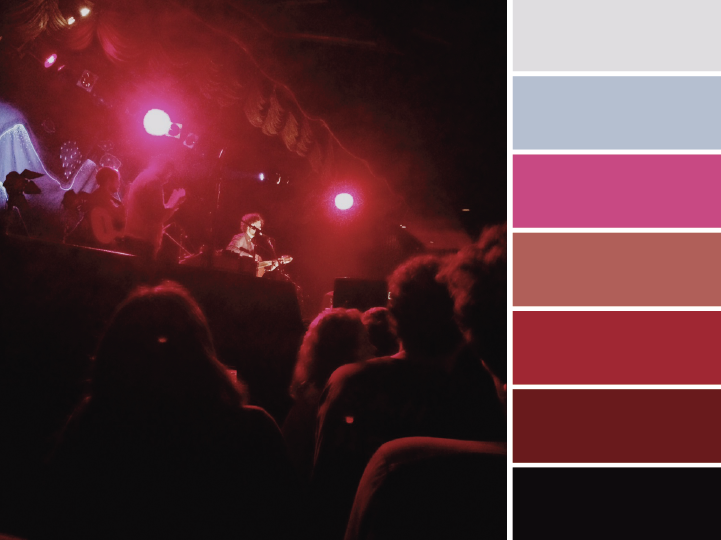
Designer and artist Jaclyn Leneé is on a 100-day stretch doing a color palette everyday based on a different picture. See all of her palettes so far on her Tumblr.

~~Update~~

I reached out to Jaclyn on Twitter to ask a couple of questions about her inspiration and feelings around the project — see below:

What’s your process for coming up with the color palette for each photograph?

Jaclyn: I’m delighted by color in everyday life. I snap photos of subjects and textures I find beautiful, and pull colors from them.

How does this project relates to the way you use color in your design work?

Jaclyn: I frequently look online for color inspiration. Since I started this project, I’ve pulled from my own palettes. It is satisfying to design with my own color stories, rather than use a palette from Kuler, or elsewhere.

Do you expect things to get… repetitive by the 100th day? How do you look for new subjects and/or diff results?

Jaclyn: I doubt it. Every image is different, the lighting different, the subject different. Endless possibilities. It is all about opening my eyes to the world around me. I take a lot of walks and keep my eyes peeled for color and texture.

I’d like to thank Jaclyn for taking the time to answer these questions – great insights for anyone who wants to dive deeper into working with color

A primer to start writing CSS with BEM-style syntax by Johan Ronsse. Good stuff, although I disagree with Johan when he says BEM is unnecessary for small and personal sites.

Personal project or not, writing CSS with BEM makes class-naming much more constrained (and well-documented), pushing you to write styling and markup in a more structured manner.

If you’ve never heard of BEM, this article by CSS-Tricks is another great way to get started.

I can’t deny that Slack has a nicer aesthetic than HipChat. It does look nice and it is fun to use. But here’s the thing — a lot of nicely designed products never take off or get noticed. Good design is not enough. There are so many pieces to consider and things you have to nail to get a product out ahead of the pack.

Here’s my list.

A great follow-up to Andrew Wilkinson’s piece about Slack and its secret sauce — both have their merits, and both are right to a certain extent.

Google gets most of their revenue from putting advertising into the products & services they provide. The people who use Google‘s products and services are not Google’s customers, the advertisers are Google’s customers.

(…)

Newspapers, magazines, and television networks have dealt with this same issue for decades now. (…) from hiding a magazine‘s table of contents in 20 pages of ads to shrieking online advertising to commercials that are louder than the shows to clunky product placement to trimming scenes from syndicated shows to cram in more commercials. From ABC to Vogue to the New York Times, you’re not the customer and it shows.

Good insights by Kottke on products and the eternal battle (some) companies wage against their own customers.

Like a well-built home, great software focuses on giving its users hundreds of small, satisfying interactions. A great transition in a mobile app gives us the same feeling we get from using a well-made door handle on a solid oak door — you may not be able to put your finger on it, but man, does the house ever feel well built. Slack is really fun to use. It feels like a well-built house.

Andrew Wilkinson lays out the design work they did for Slack and how it is (or might be?) their secret recipe for success.

We’re been working towards this “when you walk around, your phone should buzz you and tell you about the awesome things you don’t yet know about” vision of the future for a long time. Honestly, we were thinking about this stuff with Dodgeball @ Google, and were motivated to build Foursquare because we wanted this to exist so badly. So, want a brief history of how we got from 2009 -> 2015?

Buried deep inside a Product Hunt discussion thread, Foursquare founder Dennis Crowley gives a recap of Foursquare’s design history and lays out the vision behind their Apple Watch app.

Essential reading for anyone looking to understand the long-term evolution of a product.

A tiny Mac app for people tired of the old Fontbook. Still in beta, but pretty useful — allows for filtering by Google or Typekit fonts.

Get it for free here

Anil Dash shares what it’s like to have 500.000 Twitter followers without being an “actual celebrity”, dropping honest (but also hilarious) insights along the way:

In all, aside from making people roll their eyes at me, the biggest impact of having this absurdly distended online network is that it makes my online life really weird. The weirdness is probably best demonstrated by a few of the recurring conversations that arise as a result:

“Yo, can you listen to my mixtape?” This is perhaps the most frequent side effect of having a lot of followers: People think there must be a reason people follow me, and assume I can do something for them as a result.

(…)

“Kill yourself!” If you have a lot of followers online, and especially if you have the temerity to do so while being a woman and/or a minority of some sort , you’ll often just face waves of harassment and abuse, regardless of how innocuous your statements are. I’d talk more about this, and what the social networks could do to fix things, but then the GamerGate hordes will just show up and start sending threats again, and ughhhhh who has the time? (…)

Introducing Marvel UX Testing Tools Beta
We’re introducing some incredible tools that will allow you to get in-depth insights into how users interact with your prototypes including:

  • Screen recordings of users moving through your prototype
  • Indicators of where users tapped or clicked on each screen
  • User reactions via audio and video feedback as they use your prototype
  • Ability to share test results with your team and stakeholders

For the past 3 years or so, a lot of prototyping tools popped up in the market, with Marvel and InVision being the leaders in the export-your-png-assets-and-link-them-with-hotspots category.

InVision has been paving the way with an extensive feature-set, being the first to offer Dropbox integration, automatic Sketch import, as well as the only one to add a Google Hangouts style live-call for remote user testing (it’s absolutely fantastic).

Marvel, on the other hand, has been on its own feature-spree the past few months: just after releasing prototype annotations and a Sketch import plugin, they now announced this beta for screen & front-camera recording — which, without jumping to early conclusions, seems to be a killer feature.

Not only that, but this kind of feature ties in pretty closely to one of the most pressing needs of user testing: hell, if you’re giving me prototyping tools, might as well make it easier to record and evaluate my test results.

InVision, with $35m in funding rolling in since early 2012, had a good head start, but Marvel’s mere $900k raised last year is clearly being put to good use by their team.

Considering the gigantic difference in funding they have, Marvel is kicking some serious Invision ass — while also raising the question of “perhaps you shouldn’t take 35 million dollars in funding for a freaking prototyping tool?”.

But then again, who am I to say how one should or should not run their company? Although Fred Wilson provides a compelling argument for why raising too much capital can be a bad thing.

Here‘s Evgeny Morozov (@evgenymorozov) destroying Facebook and Google’s ambition to “spread connectivity across the globe” in a single blow:

Facebook, Google’s closest competitor, pulls the same trick with connectivity. Its Internet.org initiative, which now operates in Latin America, south-east Asia and Africa, was ostensibly launched to promote digital inclusion and get the poor in the developing world online. Online they do get but it’s a very particular kind of “online”: Facebook and a few other sites and apps are free but users have to pay for everything else, often based on how much data their individual apps consume. As a result, few of these people – remember, we are talking about very poor populations – are likely to afford the world outside Facebook’s content empire.

Here is the Varian rule at work again: on the face of it, the poor do get what the rich have already – internet connectivity. But the key difference is not hard to spot. Unlike the rich, who pay for their connectivity with their cash, the poor pay for it with their data – the data that Facebook would one day monetise in order to justify the entire Internet.org operation.

Google‘s chief economist, Hal Varian, has such narrow-minded logic it could make someone think he’s overlooking some “details” in good faith, but when the “details” are the economic reality of 2/3 of the people in the globe, it makes very clear what’s behind the bullshit of his “Luxury is already here – it’s just not very evenly distributed”: a desire to profit on top of people that have much less than you do, providing the same service the western-white-middle-class world already has, for much much more.

When Tidal made its big media push at the end of March, the core message was clear: while other streaming music services like Spotify and Pandora pay a pittance to artists, Tidal offers musicians a better deal. Unfortunately, Tidal also opted to use super stars like Nicki Minaj and Beyonce as spokespersons for the app. The result was the ultimate mixed message: You should feel sorry about how little money Nicki makes.

Spot on analysis of why hardly anybody gives a crap about Tidal.

This humorous video also drives the point home pretty well.

Learning to design is, first of all, learning to see. Designers see more, and more precisely. This is a blessing and a curse—once we have learned to see design, both good and bad, we cannot un-see. The downside is that the more you learn to see, the more you lose your “common” eye, the eye you design for. […]

This is why excellent designers do not just develop a sharper eye. They try to keep their ability to see things as a customer would. You need a design eye to design, and a non-designer eye to feel what you designed.

“See with one eye, feel with the other.” —Paul Klee

A great read on the nature of design, from the folks over at IA.net

His tweets can be cute, or goofy, or nonsensical, and always, always childish. They show the five year-old’s view of the touchscreen keyboard, the emoji set, the world captured by a phone camera and Google image search. They reveal some of his interests — sharks, himself and his family—and his mode of expression. […]

Emoji are such a perfect medium for a child. […] “I like how beautiful they are,” says @beebaaahp. “Emoji is cool and it has amazing pictures. I like to type emoji a lot and be funny.”

I recently nuked my personal website, partly inspired by Kevin M. Jackson‘s new site above. This link blog is pretty much what’s left of it.

Without getting too sentimental about it, the weight of keeping a personal brand while selling myself as a designer and constantly worrying about presenting my old work was beginning to weight on my shoulders. Better to nuke the whole thing and start fresh 1.

By the way, if you’re in the midst of re-doing your portfolio, this article by Alex Cican might come in handy.

1. It‘s relevant to note that my personal website is not my main source of work and/or revenue, by any means. Needless to say, don’t destroy your portfolio site if your bread & butter depends on it.

When I checked the documentation for HealthKit […] I was disappointed to find out that Apple did not include anything related to menstruation and the reproductive health of roughly half of the world’s population.

In case you’re wondering whether Health is only concerned with a few basics: Apple has predicted the need to input data about blood oxygen saturation, your daily molybdenum or pathogenic acid intake, cycling distance, number of times fallen and your electrodermal activity, but nothing to do with recording information about your menstrual cycle.

I know I‘ve been heavy on the Buzzfeed bandwagon lately, but Ben Thompson’s analysis is too good an opportunity to pass up. Seriously, follow this guy.

This small tidbit serves as the perfect example to his argument — overheard at a recent New York Times editorial meeting:

[…] When the conversation turns to a vivid story from Liberia, where Ebola has overtaken a particular neighborhood in Monrovia, one editor proudly reports that she believes the Times is the only outlet with a reporter on the ground, which makes everyone happy until another editor says, “I think BuzzFeed actually has somebody there.” There is momentary silence.

A bad survey won’t tell you it’s bad. It’s actually really hard to find out that a bad survey is bad — or to tell whether you have written a good or bad set of questions. […]

Most seductively, surveys yield responses that are easy to count and counting things feels so certain and objective and truthful.

Even if you are counting lies.

Surveys are usually the easiest way to gather “relevant” user feedback, but it’s easy to see how they can be used to cop out of really listening to your users.

Not saying surveys are now forever banned as good practices of user research, but when Erika Hall is saying stuff like this, you tread carefully at the very least.

The computer server that transmitted and received Hillary Rodham Clinton‘s emails — on a private account she used exclusively for official business when she was secretary of state — traced back to an Internet service registered to her family’s home in Chappaqua, New York, according to Internet records reviewed by The Associated Press.

From her residence, no less. That’s some serious badassery right there. Also, illegal in the United States since 2009. Oops.